Dignity Health: Simplify
How can we design an app that allows employees to focus more on their patients by alerting them to relevant information as well as connecting them to their colleagues effortlessly?

Introduction
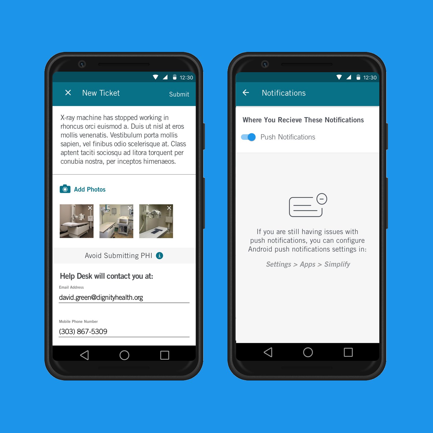
Dignity Health’s Simplify application enables healthcare workers to engage with their community, receive general facility alerts, and report equipment issues with ease. As a part of their Digital Transformation Initiative, Dignity Health sought to enable their staff to focus more on their patients, instead of struggling with confusing and dated technology.
Client
Dish Networks
Project Duration
March–June 2018
Team
1 Project Manager, 1 Product Designer, 3 DH Stakeholders
Role
Lead Designer • UX • UI • Prototyping
Application Structure
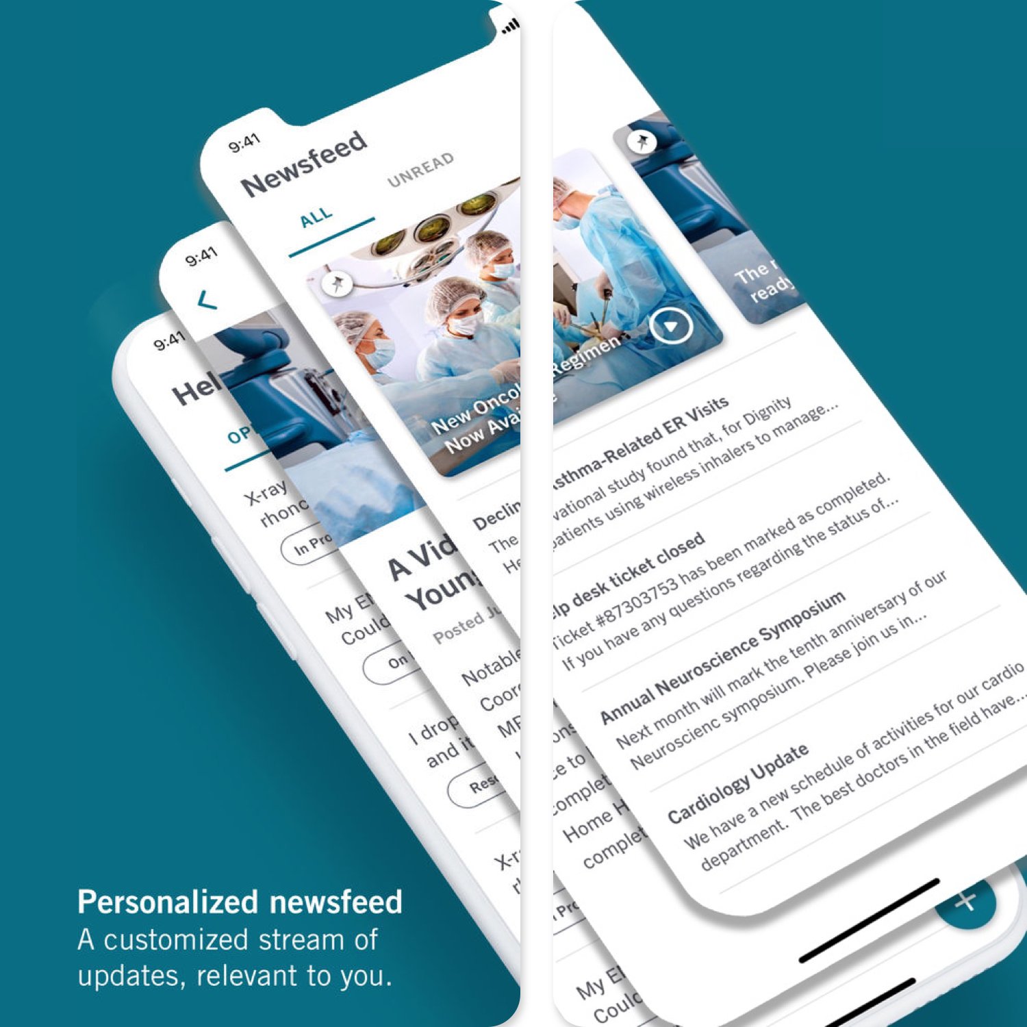
The app has 3 main areas: newsfeed, Continuing Education Videos, and the Help Desk tool.
The newsfeed that displays relevant news, CE opportunities, and speaking events based on their facility and specialty they selected during their profile creation.
The video section of Simplify allows users to earn some CE credits by watching personalized videos and lectures at their fingertips.
Personalized Illustrations
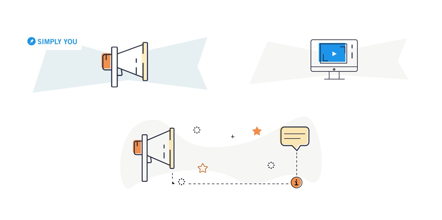
Working with Dignity Health, we worked to delight the users through meaningful illustrations that functioned as empty states or default images throughout the application.
Churn & Burn
One of the downsides of agency design cycles are you don’t always get to see how your designs are implemented and perform. Nor can you test and iterate. We worked with our stakeholders and delivered designs and documentation and was on to the next thing. Sometimes you just need to rely on your past experiences and deliver something based on solid design principles.


